Expo と NativeWind で質の高い UI を構築する
Expo、NativeWind、Reanimated を使って、コードから直接 React Native アプリを設計する方法を学びます。再利用可能なコンポーネントを作り、テーマを実装し、Figma は使いません。
日本語
コピー
この記事は Thomino によるゲスト投稿です。彼は Native Templates の作者で、X でフォローする価値もあります。
…
私が Web 開発を始めたのは IE6 の時代です。画像を切ってボックスシャドウを作り、透明 GIF で角丸を再現し、テーブルを入れ子にしてレイアウトを組んでいました。フロントエンド開発の「暗黒時代」です。
幸い、時代は変わりました。Expo、NativeWind、Reanimated を組み合わせれば、アプリのデザインは驚くほど簡単です。実際、私はもう Figma を使っていません。コードを直接書いてデザインし、Expo Go でリアルタイムにプレビューしています。
ここからは、私がワークフローで使っている再利用可能なコンポーネントでアプリをどう組み立てているかを紹介します。これらのコンポーネントがあれば、エディタ上でそのままデザインできます。テーマの扱い方と、アニメーション付きのテーマ切り替えスイッチの作り方も説明します。
再利用可能なコンポーネント
アプリはそれぞれ違いますが、多くの画面、フロー、コンポーネントは共通しています。そこで私はテンプレートを一式用意し、新規プロジェクトを始めたら必要に応じて土台として使えるようにしています。そのために重要なのは、コンポーネントが再利用でき、かつアプリごとにスタイルを簡単に変えられることです。
以下は NativeTemplates で実装している例です。
NativeWind で柔軟な header コンポーネントを作る
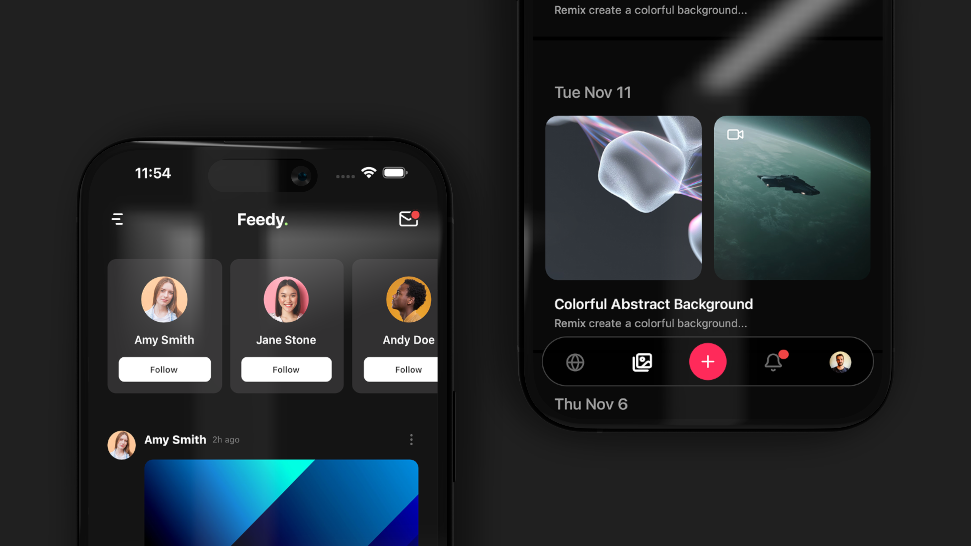
おそらく最も重要で基本的なコンポーネントです。header は必要に応じて簡単に調整できるだけの柔軟性がなければなりません。
import React from "react";
import { View, Text, TouchableOpacity } from "react-native";
import { useThemeColors } from "app/contexts/ThemeColors";
import { Link, router } from "expo-router";
import Icon, { IconName } from "./Icon";
import { useSafeAreaInsets } from "react-native-safe-area-context";

type HeaderProps = {
  title: string,
  showBackButton?: boolean,
  rightComponents?: React.ReactNode[],
};

const Header: React.FC<HeaderProps> = ({
  title,
  showBackButton = false,
  rightComponents = [],
}) => {
  const colors = useThemeColors();
  const insets = useSafeAreaInsets();

  const handleBackPress = () => {
    router.back();
  };

  return (
    <View
      style={{ paddingTop: insets.top }}
      className="w-full pb-2 flex-row justify-between px-6 bg-background"
    >
      <View className="flex-row items-center flex-1">
        {showBackButton && (
          <TouchableOpacity onPress={handleBackPress} className="mr-4 py-4">
            <Icon name="ArrowLeft" size={24} color={colors.icon} />
          </TouchableOpacity>
        )}

        <View className="py-4">
          <Text className="text-lg font-bold" style={{ color: colors.text }}>
            {title}
          </Text>
        </View>
      </View>

      {rightComponents.length > 0 && (
        <View className="flex-row items-center justify-end flex-1">
          {rightComponents.map((component, index) => (
            <View key={index} className="ml-6">
              {component}
            </View>
          ))}
        </View>
      )}
    </View>
  );
};

export default Header;
// Basic header with title
<Header title="Home" />
// Header with back button
<Header
title="Details"
showBackButton
/>
// Header with action icons
<Header
title="Messages"
rightComponents={[
<HeaderIcon key="search" icon="Search" href="/search" />,
<HeaderIcon key="settings" icon="Settings" href="/settings" />
]}
/>
React Native でアンカー付き tab ナビゲーションを作る
アイコン、アニメーション、アバターから選べます。
<TabTrigger name="home" href="/" asChild>
  <TabButton labelAnimated={true} icon="Home">Home</TabButton>
</TabTrigger>
<TabTrigger name="profile" href="/profile" asChild>
  <TabButton labelAnimated={true} avatar={require('@/assets/img/thomino.jpg')}>Profile</TabButton>
</TabTrigger>
マルチステップフォームと onboarding フローを構築する
これは非常によく使います。onboarding やその他のユーザーフローに特に向いています。onboarding はユーザーをアクティブ化し、初期離脱を減らすために欠かせません。
<MultiStep
  onComplete={handleComplete}
  onClose={handleClose}
  headerTitle="Get Started"
>
  <Step title="Profile">
    <Profile />
  </Step>
  <Step title="Role">
    <Role />
  </Step>
  <Step title="Capabilities">
    <Capabilities />
  </Step>
  <Step title="Review">
    <Review />
  </Step>
</MultiStep>;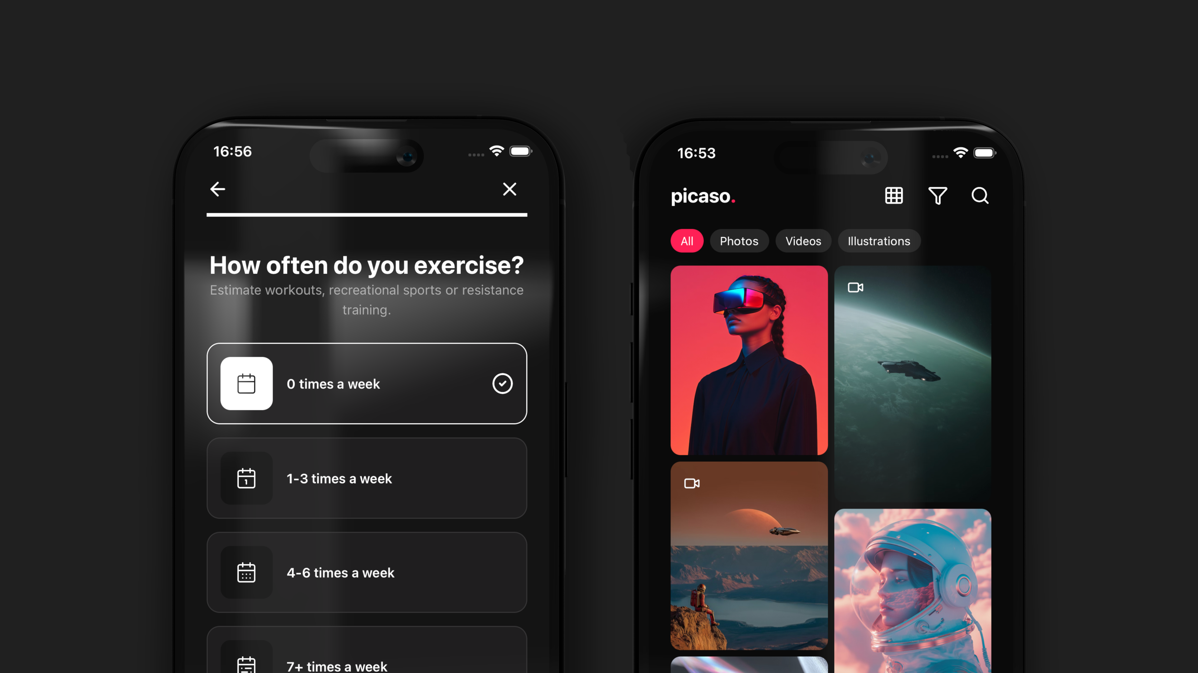
フィルタとフォームのための再利用可能な chip コンポーネント
基本的なものですが、フィルタやフォームでよく使います。
<Chip
  label="Custom"
  className="my-2 mx-1"
  size="xl"
/>すべてのコンポーネントは私のドキュメントで確認できます。
NativeWind でテーマ変数を実装する
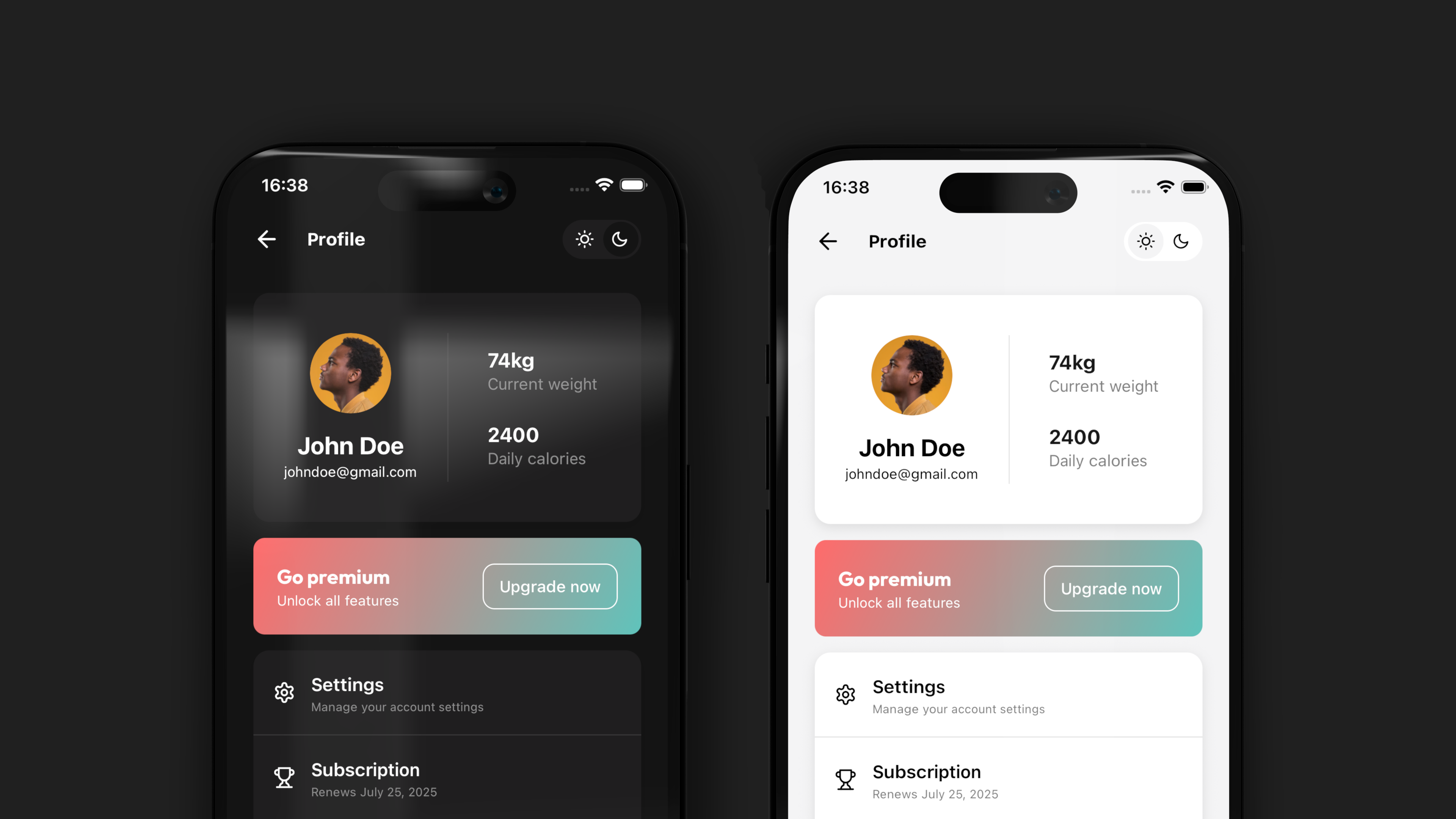
NativeWind はテーマの扱いを非常に強力にします。vars のおかげで、1 つのファイルでアプリ全体のテーマを切り替えられます。これにより、ライトモードとダークモードが後付けではなく、デザインシステムの一部であることが保証されます。
import { vars } from "nativewind";

export const themes = {
  light: vars({
    "--color-primary": "#000000",
    "--color-invert": "#ffffff",
    "--color-secondary": "#ffffff",
    "--color-background": "#F4F4F5",
    "--color-darker": "#F4F4F5",
    "--color-text": "#000000",
    "--color-highlight": "#7E55D8",
    "--color-border": "rgba(0, 0, 0, 0.15)",
  }),
  dark: vars({
    "--color-primary": "#ffffff",
    "--color-invert": "#000000",
    "--color-secondary": "#1e1e1e",
    "--color-background": "#141414",
    "--color-darker": "#000000",
    "--color-text": "#ffffff",
    "--color-highlight": "#7E55D8",
    "--color-border": "rgba(255, 255, 255, 0.15)",
  }),
};
Reanimated で動くダークモードスイッチを作る
import { Pressable, View } from "react-native";
import { useTheme } from "@/app/contexts/ThemeContext";
import Feather from "@expo/vector-icons/Feather";
import Animated, {
  useSharedValue,
  useAnimatedStyle,
  withSpring,
} from "react-native-reanimated";
import { useEffect } from "react";

const ThemeToggle = () => {
  const { theme, toggleTheme } = useTheme();
  const isDark = theme === "dark";
  const translateX = useSharedValue(isDark ? 36 : 3.5);

  useEffect(() => {
    translateX.value = withSpring(isDark ? 36 : 3.5, {
      damping: 15,
      stiffness: 150,
    });
  }, [isDark]);

  const animatedStyle = useAnimatedStyle(() => {
    return {
      transform: [{ translateX: translateX.value }],
    };
  });

  return (
    <Pressable
      onPress={toggleTheme}
      className="w-20 h-10 p-1 bg-secondary relative flex-row rounded-full items-center justify-between"
    >
      <Icon icon="sun" />
      <Icon icon="moon" />
      <Animated.View
        style={[animatedStyle]}
        className="w-9 h-9 bg-background rounded-full items-center justify-center flex flex-row absolute"
      />
    </Pressable>
  );
};

const Icon = (props: any) => {
  const { theme } = useTheme();
  const isDark = theme === "dark";

  return (
    <View className="w-9 h-9 relative z-50 rounded-full items-center justify-center flex flex-row">
      <Feather
        name={props.icon}
        size={16}
        color={`${isDark ? "white" : "black"}`}
      />
    </View>
  );
};

export default ThemeToggle;
すぐ使えるログイン、オンボーディング、設定画面のテンプレート
しっかりしたコンポーネントの土台があれば、テンプレートを組むのは驚くほど速いです。ほぼどのアプリにも共通する画面がいくつかあります。ログイン、サインアップ、オンボーディング、プロフィール設定、プライバシーなどです。そしてここで、すべてのコンポーネントが生きてきます。
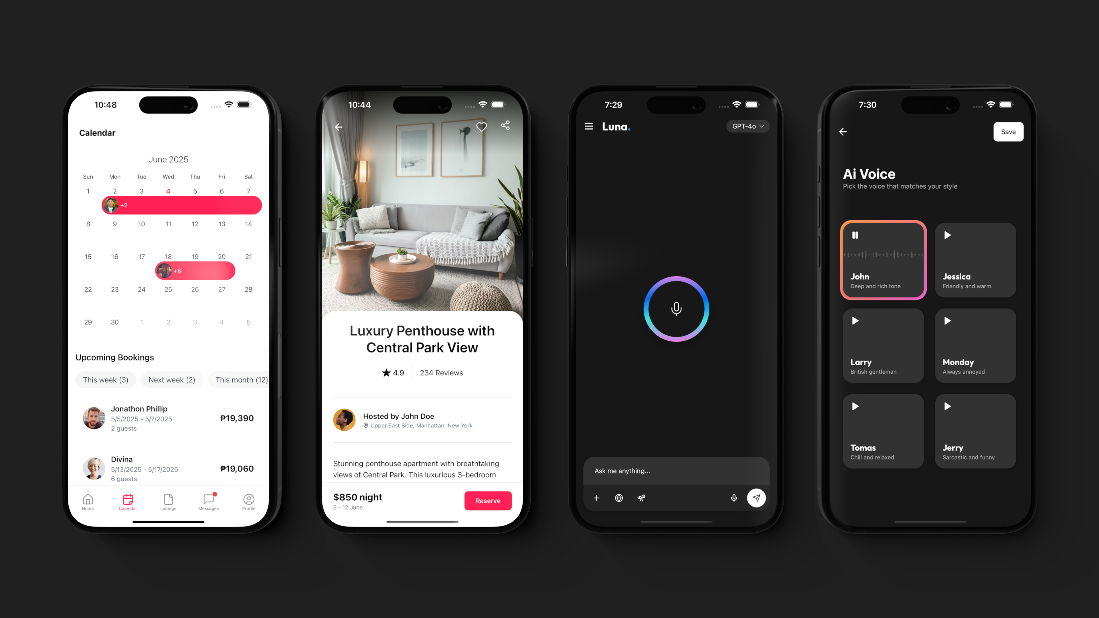
export default function ProfileScreen() {
  return (
    <View className="flex-1 bg-light-primary dark:bg-dark-primary">
      <Header
        leftComponent={<ThemeToggle />}
        rightComponents={[
          <HeaderIcon icon="ChartBar" href="/screens/analytics" />,
        ]}
      />
      <View className="flex-1 bg-light-primary dark:bg-dark-primary">
        <ThemedScroller>
          <AnimatedView className="pt-4" animation="scaleIn">
            <SubscriptionCard />
            <View className="gap-1 bg-secondary rounded-3xl">
              <ListLink
                className="px-4 py-2 border-b border-border"
                showChevron
                title="Account settings"
                icon="Settings"
                href="/screens/settings"
              />
              <ListLink
                className="px-4 py-2 border-b border-border"
                showChevron
                title="Billing"
                icon="CreditCard"
                href="/screens/billing"
              />
            </View>
          </AnimatedView>
        </ThemedScroller>
      </View>
    </View>
  );
}
Expo がプラットフォームを与え、NativeWind がスタイル言語を与えてくれる。そうして作られたアプリは、動くだけでなく見た目も良いのです。
次のプロジェクトを素早く立ち上げたいなら、ここにあるすべての React Native Expo テンプレートか、GitHub の Expo Playground を覗いてみてください。