使用 Expo 和 NativeWind 构建高质量 UI
学习如何直接用代码设计 React Native 应用,借助 Expo、NativeWind 和 Reanimated。构建可复用组件,实现主题化,跳过 Figma。
中文
复制
本文是 Thomino 的客座文章——他是 Native Templates 的作者,也很值得在 X 上关注。
…
我从 IE6 时代就开始做 Web 开发了。我还记得用切好的图片做盒阴影、用透明 GIF 做圆角、用嵌套表格搭结构。那是前端开发的“黑暗时代”。
好在时代变了。把 Expo、NativeWind 和 Reanimated 组合起来,设计应用变得轻而易举。事实上我已经不用 Figma 了,直接写代码设计,用 Expo Go 实时预览。
下面我来展示自己是怎么用工作流里那些可复用组件搭建应用的。有了这些组件,我可以直接在编辑器里做设计。我还会讲主题怎么处理,以及怎么做一个带动画的主题切换开关。
可复用组件
每个应用都不一样,但大多数应用共享很多页面、流程和组件。所以我做了一套模板,新项目一开就能按需拿来当基础。要做到这一点,关键是组件可复用,又能针对具体应用轻松改样式。
以下是我在 NativeTemplates 里实现的几个例子。
用 NativeWind 构建灵活的 header 组件
这大概是最重要、最基础的一个。header 组件必须足够灵活,能按需轻松调整。
import React from "react";
import { View, Text, TouchableOpacity } from "react-native";
import { useThemeColors } from "app/contexts/ThemeColors";
import { Link, router } from "expo-router";
import Icon, { IconName } from "./Icon";
import { useSafeAreaInsets } from "react-native-safe-area-context";

type HeaderProps = {
  title: string,
  showBackButton?: boolean,
  rightComponents?: React.ReactNode[],
};

const Header: React.FC<HeaderProps> = ({
  title,
  showBackButton = false,
  rightComponents = [],
}) => {
  const colors = useThemeColors();
  const insets = useSafeAreaInsets();

  const handleBackPress = () => {
    router.back();
  };

  return (
    <View
      style={{ paddingTop: insets.top }}
      className="w-full pb-2 flex-row justify-between px-6 bg-background"
    >
      <View className="flex-row items-center flex-1">
        {showBackButton && (
          <TouchableOpacity onPress={handleBackPress} className="mr-4 py-4">
            <Icon name="ArrowLeft" size={24} color={colors.icon} />
          </TouchableOpacity>
        )}

        <View className="py-4">
          <Text className="text-lg font-bold" style={{ color: colors.text }}>
            {title}
          </Text>
        </View>
      </View>

      {rightComponents.length > 0 && (
        <View className="flex-row items-center justify-end flex-1">
          {rightComponents.map((component, index) => (
            <View key={index} className="ml-6">
              {component}
            </View>
          ))}
        </View>
      )}
    </View>
  );
};

export default Header;
// Basic header with title
<Header title="Home" />
// Header with back button
<Header
title="Details"
showBackButton
/>
// Header with action icons
<Header
title="Messages"
rightComponents={[
<HeaderIcon key="search" icon="Search" href="/search" />,
<HeaderIcon key="settings" icon="Settings" href="/settings" />
]}
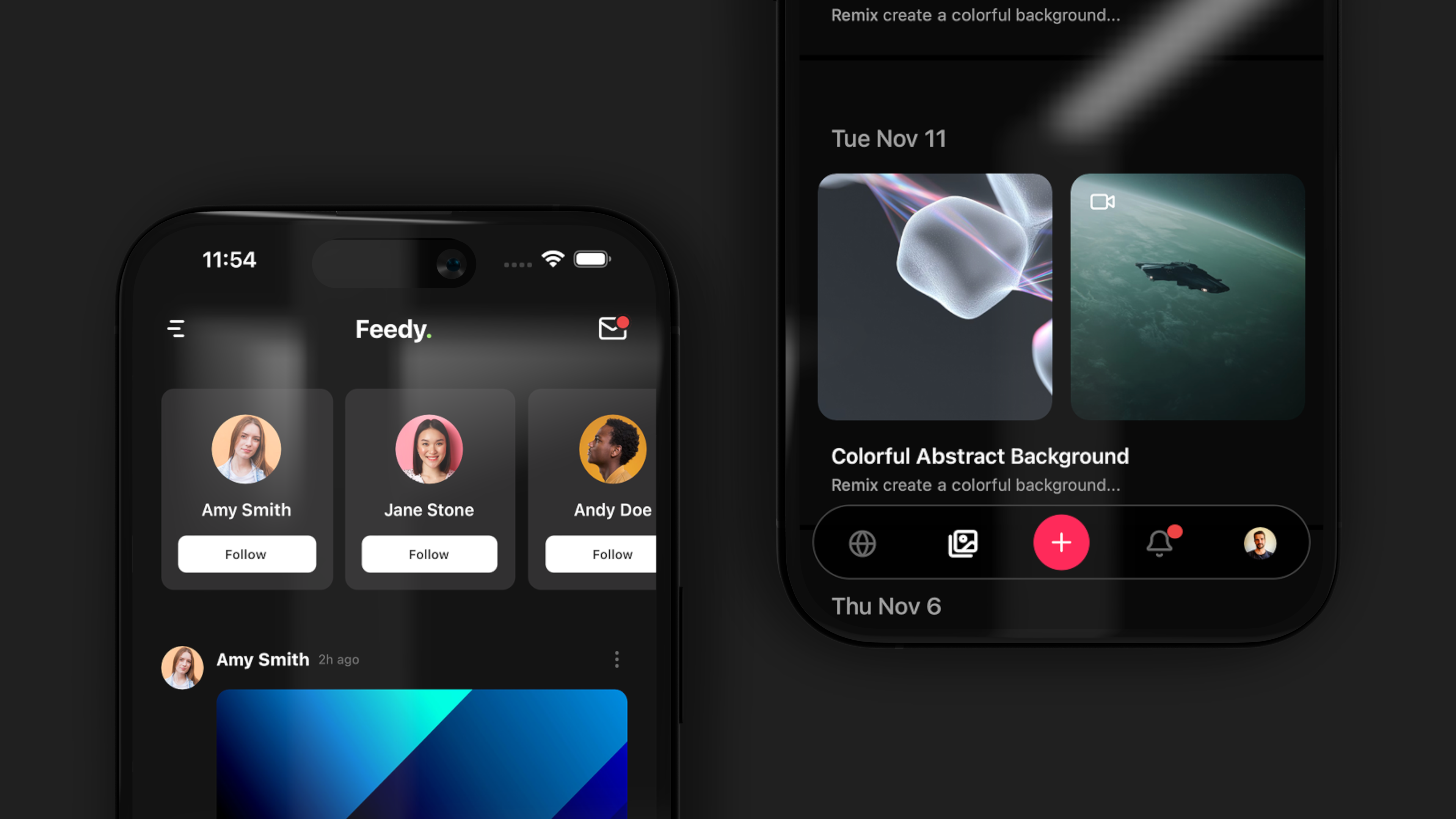
/>
在 React Native 中创建带锚点的 tab 导航
选一个图标、动画或头像。
<TabTrigger name="home" href="/" asChild>
  <TabButton labelAnimated={true} icon="Home">Home</TabButton>
</TabTrigger>
<TabTrigger name="profile" href="/profile" asChild>
  <TabButton labelAnimated={true} avatar={require('@/assets/img/thomino.jpg')}>Profile</TabButton>
</TabTrigger>
构建多步表单和 onboarding 流程
这个我用得非常多,特别适合 onboarding 和其他用户流程。Onboarding 对激活用户、降低早期流失至关重要。
<MultiStep
  onComplete={handleComplete}
  onClose={handleClose}
  headerTitle="Get Started"
>
  <Step title="Profile">
    <Profile />
  </Step>
  <Step title="Role">
    <Role />
  </Step>
  <Step title="Capabilities">
    <Capabilities />
  </Step>
  <Step title="Review">
    <Review />
  </Step>
</MultiStep>;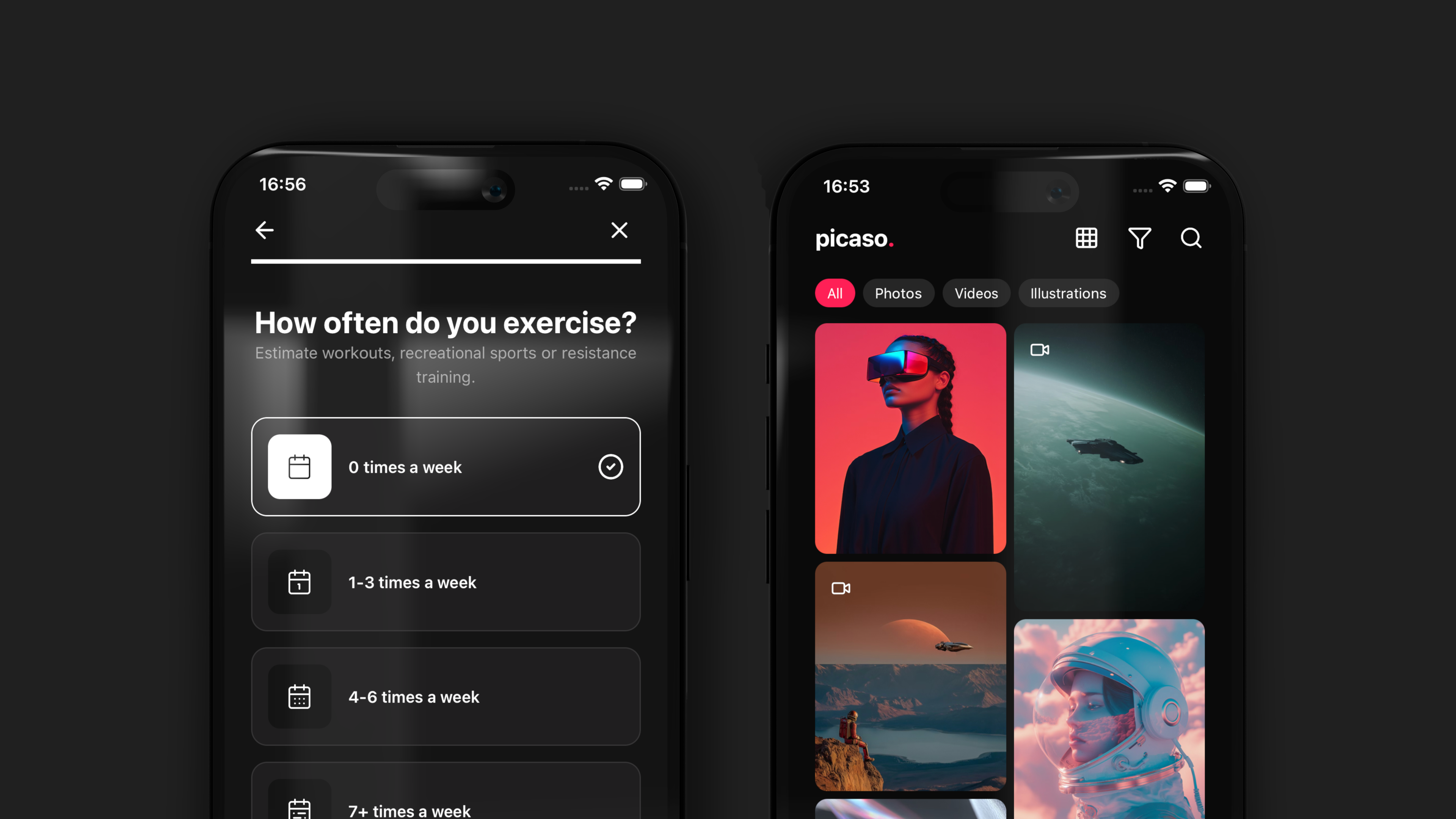
用于筛选和表单的可复用 chip 组件
这个很基础,但在筛选或表单里用得很多。
<Chip
  label="Custom"
  className="my-2 mx-1"
  size="xl"
/>所有组件都可以在我的文档里查看。
用 NativeWind 实现主题变量
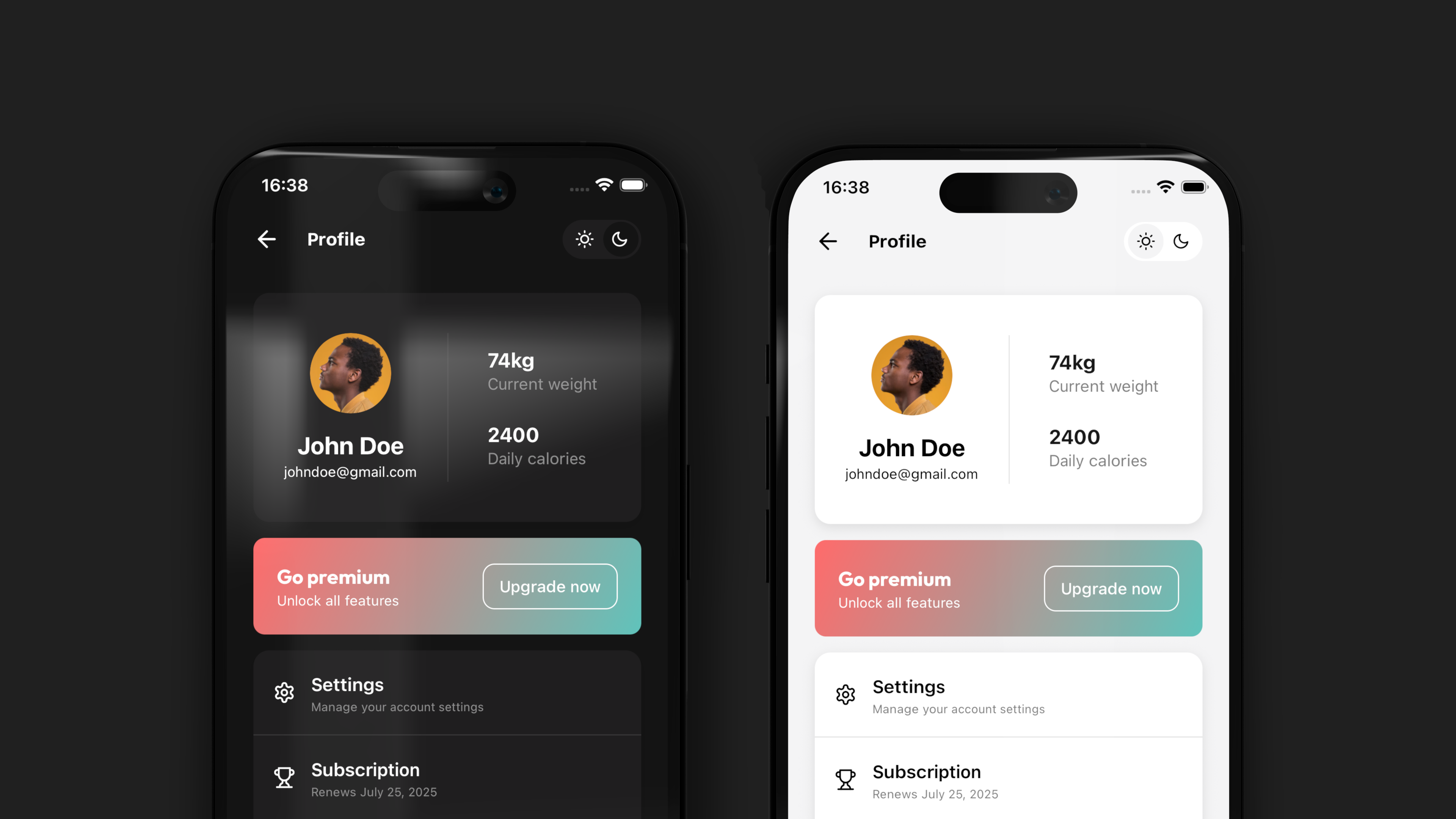
NativeWind 让主题处理变得非常强大。借助 vars,我们可以在一个文件里切换整个应用的主题。这样就能保证浅色和深色模式不是事后补上的,而是设计系统的一部分。
import { vars } from "nativewind";

export const themes = {
  light: vars({
    "--color-primary": "#000000",
    "--color-invert": "#ffffff",
    "--color-secondary": "#ffffff",
    "--color-background": "#F4F4F5",
    "--color-darker": "#F4F4F5",
    "--color-text": "#000000",
    "--color-highlight": "#7E55D8",
    "--color-border": "rgba(0, 0, 0, 0.15)",
  }),
  dark: vars({
    "--color-primary": "#ffffff",
    "--color-invert": "#000000",
    "--color-secondary": "#1e1e1e",
    "--color-background": "#141414",
    "--color-darker": "#000000",
    "--color-text": "#ffffff",
    "--color-highlight": "#7E55D8",
    "--color-border": "rgba(255, 255, 255, 0.15)",
  }),
};
用 Reanimated 做一个会动的深色模式开关
import { Pressable, View } from "react-native";
import { useTheme } from "@/app/contexts/ThemeContext";
import Feather from "@expo/vector-icons/Feather";
import Animated, {
  useSharedValue,
  useAnimatedStyle,
  withSpring,
} from "react-native-reanimated";
import { useEffect } from "react";

const ThemeToggle = () => {
  const { theme, toggleTheme } = useTheme();
  const isDark = theme === "dark";
  const translateX = useSharedValue(isDark ? 36 : 3.5);

  useEffect(() => {
    translateX.value = withSpring(isDark ? 36 : 3.5, {
      damping: 15,
      stiffness: 150,
    });
  }, [isDark]);

  const animatedStyle = useAnimatedStyle(() => {
    return {
      transform: [{ translateX: translateX.value }],
    };
  });

  return (
    <Pressable
      onPress={toggleTheme}
      className="w-20 h-10 p-1 bg-secondary relative flex-row rounded-full items-center justify-between"
    >
      <Icon icon="sun" />
      <Icon icon="moon" />
      <Animated.View
        style={[animatedStyle]}
        className="w-9 h-9 bg-background rounded-full items-center justify-center flex flex-row absolute"
      />
    </Pressable>
  );
};

const Icon = (props: any) => {
  const { theme } = useTheme();
  const isDark = theme === "dark";

  return (
    <View className="w-9 h-9 relative z-50 rounded-full items-center justify-center flex flex-row">
      <Feather
        name={props.icon}
        size={16}
        color={`${isDark ? "white" : "black"}`}
      />
    </View>
  );
};

export default ThemeToggle;
现成的登录、引导和设置页面模板
有了扎实的组件基础,搭模板快得离谱。几乎每个 App 都有那么几个页面是共通的,比如登录、注册、引导、个人资料设置、隐私等等。但在这里,所有组件都活了起来!
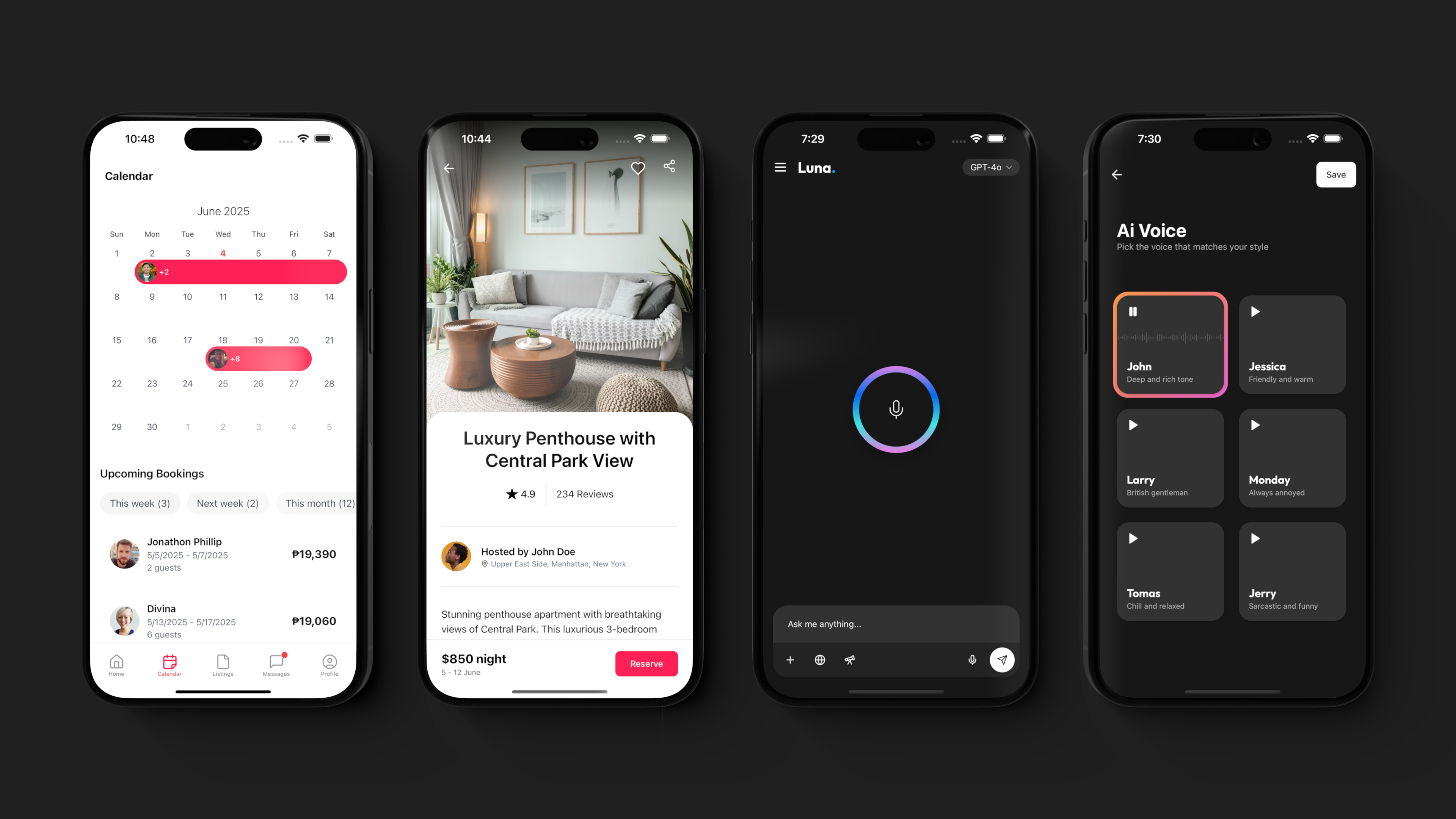
export default function ProfileScreen() {
  return (
    <View className="flex-1 bg-light-primary dark:bg-dark-primary">
      <Header
        leftComponent={<ThemeToggle />}
        rightComponents={[
          <HeaderIcon icon="ChartBar" href="/screens/analytics" />,
        ]}
      />
      <View className="flex-1 bg-light-primary dark:bg-dark-primary">
        <ThemedScroller>
          <AnimatedView className="pt-4" animation="scaleIn">
            <SubscriptionCard />
            <View className="gap-1 bg-secondary rounded-3xl">
              <ListLink
                className="px-4 py-2 border-b border-border"
                showChevron
                title="Account settings"
                icon="Settings"
                href="/screens/settings"
              />
              <ListLink
                className="px-4 py-2 border-b border-border"
                showChevron
                title="Billing"
                icon="CreditCard"
                href="/screens/billing"
              />
            </View>
          </AnimatedView>
        </ThemedScroller>
      </View>
    </View>
  );
}
Expo 给了我们平台,NativeWind 给了我们样式语言,做出来的 App 不光能用,还好看。
如果你想快速启动下一个项目,可以看看这里所有的 React Native Expo 模板,或者我在 GitHub 上的 Expo Playground。