バランスの取れたモバイルレイアウトを構築する:Expo Router で tabs と drawers をネストする
Expo Router でボトムタブバーをドロワーで包む。ファイルシステムベースのルーティングで、テーマはすっきり、ジェスチャーがタブバーと衝突しない書き方。
日本語
コピー
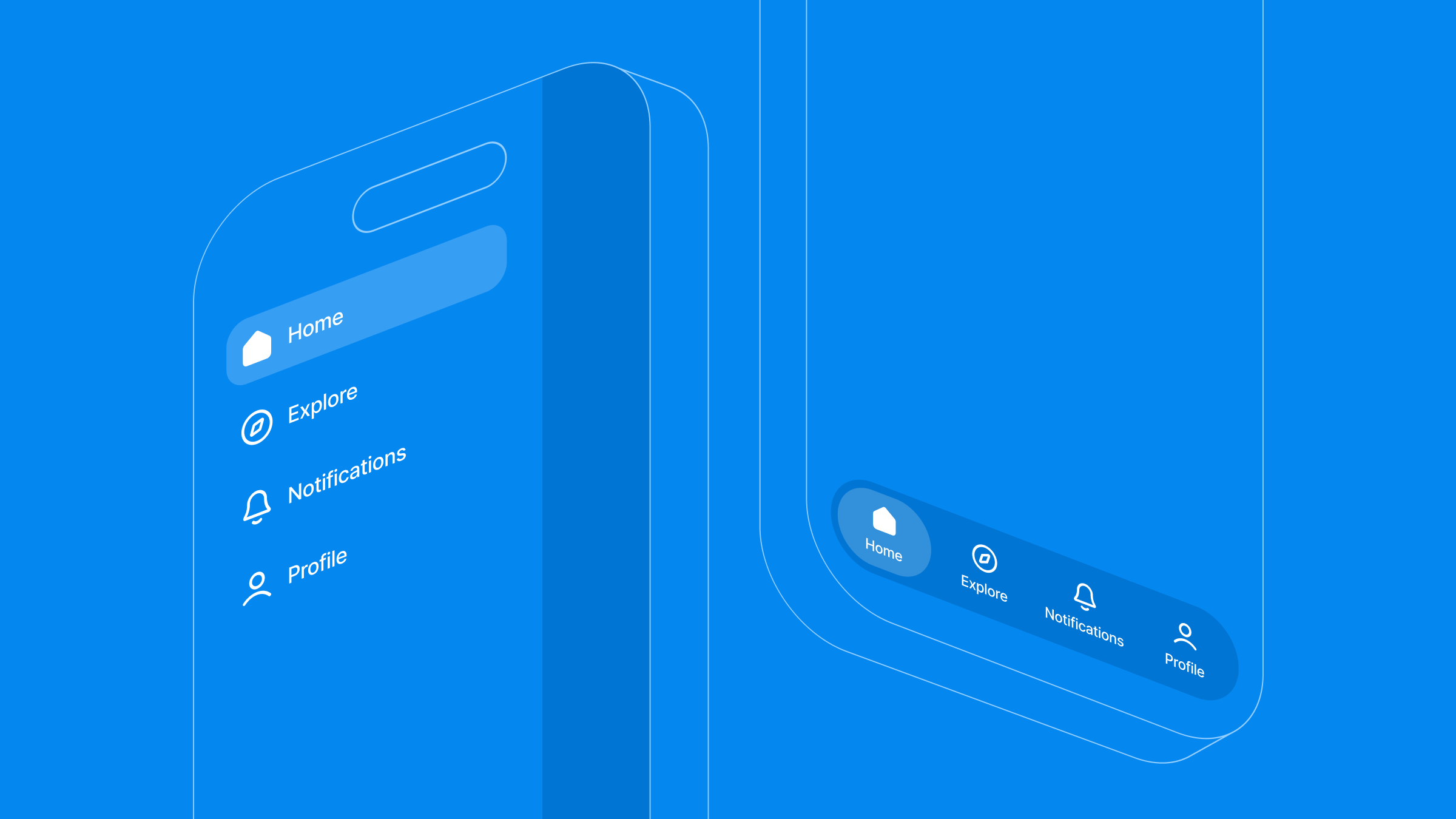
ボトムタブバーはすでに動いている。そこにデザインが上がってきた。ハンバーガーメニューが追加され、タブバーの上からスライドして出てくる。ワークスペースの切り替え、設定、サポートへの導線だ。これで2つのナビゲーションを同時に扱うことになる。片方がもう片方にネストされ、しかもドロワーのスワイプジェスチャーが画像カルーセルと衝突してはいけないし、メニューを開くたびにタブの状態がリセットされてもいけない。
固定のボトムタブバーとグローバルなサイドドロワーの組み合わせは、クロスプラットフォームアプリではよくある。だが、この2つのナビゲーションツリーをいい加減にネストすると、パフォーマンスコストとジェスチャー衝突がついてくる。
Expo Router なら、こうしたフローをファイルシステムのディレクトリにそのままマッピングできる。コードはモジュール化された状態を保て、メンテナンスも効く。裏で動いているのはこれまで通りネイティブのナビゲーションコンポーネントだ。Twitter でデモを共有したところ、Expo チームから連絡があり、プロセスを記事にしてほしいと言われた。この記事を読み終えれば、ドロワーがタブナビゲーターを包む構造と、テーマとジェスチャー処理まで含めて、全体が引っかからずに動くようになるはずだ。
アーキテクチャの相性:ドロワーとタブをいつネストすべきか
ナビゲーションパターンの組み合わせは強力だが、デフォルトにするべきではない。コードを書く前に、アプリの UX が二層のナビゲーション構造から本当に恩恵を受けるか考えよう。おおまかに3つのケースがある。
-
フラットなナビゲーション(3〜5個の高レベル画面で、パスが互いに独立している):純粋なボトムタブで十分だ。ここにサイドドロワーを足すと、認知負荷と視覚的な雑さが増すだけになる。
-
コンテキストの分離(マルチタブのワークスペースで、ワークスペース切り替えやサポートといったどこからでも使うツールを整理する必要がある):タブナビゲーターを外側のドロワーコンテナにネストする。
-
ディープリンクのワークフロー(トランザクションの多いダッシュボードで、ユーザーが深い子ルート間を行き来する):ネイティブスタックナビゲーションに切り替え、コンテキスト駆動の可視性を組み合わせる。
アーキテクチャのトレードオフと制約
クリーンなファイルシステムベースのレイアウトは構造の複雑さを下げるが、いくつか知っておくべき制約がある。
-
状態の同期: 共有のグローバル状態や現在のユーザー情報を、独立したドロワールート(たとえば分離された
settings.tsx)からネストされたタブのコンテキストへ下ろすには、意図的な context のスコープ設計か、外部 store の導入が必要になる。 -
プラットフォームのジェスチャー衝突: サイドスワイプのドロワージェスチャーは、タブ内の横方向の要素——スワイプ可能なカルーセルやスワイプ削除のリスト——と衝突することがある。
swipeEdgeWidthを制限すれば、こうしたインタラクションを予測可能に保てる。
コアアーキテクチャ
ナビゲーションの状態を一貫させるには、プロジェクトのディレクトリ構造をレイアウトツリーと一対一で対応させる。Expo Router は集中管理されたルート設定ファイルを必要とせず、(drawer) や (tabs) といったフォルダのグループ化セマンティクスでビューの階層を直接宣言する。
app/
├── (drawer)/
│   ├── _layout.tsx         # Outermost navigation wrapper (configures side drawer)
│   ├── (tabs)/
│   │   ├── _layout.tsx     # Inner layout (configures persistent bottom tabs)
│   │   ├── index.tsx       # Home dashboard screen
│   │   ├── explore.tsx     # Explore feed screen
│   │   ├── notifications.tsx
│   │   └── profile.tsx     # User profile screen
│   └── settings.tsx        # Standalone global route accessed via drawer
└── _layout.tsx             # Root orchestration and app lifecycle entry point
1. ルートレベルのオーケストレーション(app/_layout.tsx)
ルートファイルはアプリのライフサイクルの起点だ。ネイティブのスプラッシュスクリーンを管理し、グローバルな context provider をマウントして、子ルートがレンダリングされる前にランタイム設定が整っているようにする。
import 'react-native-gesture-handler';
import React, { useState } from 'react';
import { Slot } from 'expo-router';
import { GestureHandlerRootView } from 'react-native-gesture-handler';
import { SafeAreaProvider } from 'react-native-safe-area-context';
import { StyleSheet } from 'react-native';
import * as ExpoSplashScreen from 'expo-splash-screen';
import { ThemeProvider } from '../src/context/ThemeContext';
import SplashScreenView from '../src/screens/SplashScreen';

// Prevent splash screen from auto-hiding before initialization checks finish
ExpoSplashScreen.preventAutoHideAsync();

export default function RootLayout() {
  const [appIsReady, setAppIsReady] = useState(false);

  const handleSplashFinish = async () => {
    setAppIsReady(true);
    // Securely unblock rendering and hide native splash once app asset states are verified
    await ExpoSplashScreen.hideAsync();
  };

  return (
    <GestureHandlerRootView style={styles.root}>
      <SafeAreaProvider>
        <ThemeProvider>
          {/* Render layout contents once splash sequencing is complete */}
          {appIsReady && <Slot />}

          <SplashScreenView onFinish={handleSplashFinish} />
        </ThemeProvider>
      </SafeAreaProvider>
    </GestureHandlerRootView>
  );
}

const styles = StyleSheet.create({
  root: { flex: 1 },
});
2. グローバルなサイドドロワーの実装(app/(drawer)/_layout.tsx)
サイドドロワーは最も外側のレイアウト境界で、expo-router/drawer モジュールで設定する。drawerType を 'front' に設定すると、ドロワーパネルは現在の画面を押しのけるのではなく、画面の上に重なる。
import React from 'react';
import { Drawer } from 'expo-router/drawer';
import { useTheme } from '@/src/hooks/useTheme';
import DrawerContent from '@/src/components/DrawerContent';

export default function DrawerLayout() {
  const { theme } = useTheme();
  const c = theme.colors;

  return (
    <Drawer
      drawerContent={(props) => <DrawerContent {...props} />}
      screenOptions={{
        headerShown: false,
        drawerType: 'front',
        drawerStyle: {
          width: 270,
          backgroundColor: c.drawerBackground,
        },
        overlayColor: 'rgba(0,0,0,0.6)',
        swipeEdgeWidth: 40,
      }}
    >
      {/* Target internal tab group layout matching file path semantics */}
      <Drawer.Screen
        name="(tabs)"
        options={{ drawerLabel: 'Dashboard' }}
      />
      {/* Standalone layout entry outside of the core bottom tab bar */}
      <Drawer.Screen
        name="settings"
        options={{ drawerLabel: 'Settings' }}
      />
    </Drawer>
  );
}
3. ネストされたボトムタブレイアウト(app/(drawer)/(tabs)/_layout.tsx)
タブレイアウトのフォルダを (drawer) パスの下にネストすれば、子ルートは自動的にドロワーの context を継承する。マイクロインタラクションはカスタムコンポーネントに置くので、レイアウトファイルはルーティングそのものに集中できる。
import React from 'react';
import { Tabs } from 'expo-router';
import { Platform } from 'react-native';
import { useTheme } from '@/src/hooks/useTheme';
import { DrawerSceneWrapper } from '@/src/components/DrawerSceneWrapper';
import AnimatedTabIcon from '@/src/components/AnimatedTabIcon';

const TABS = [
  { name: 'index', title: 'Home', icon: 'home-outline', activeIcon: 'home' },
  { name: 'explore', title: 'Explore', icon: 'compass-outline', activeIcon: 'compass' },
  { name: 'notifications', title: 'Notifications', icon: 'notifications-outline', activeIcon: 'notifications', badge: true },
  { name: 'profile', title: 'Profile', icon: 'person-outline', activeIcon: 'person' },
];

export default function TabsLayout() {
  const { theme, isDark } = useTheme();
  const c = theme.colors;

  const tabBarBg = isDark ? 'rgba(11,11,19,0.98)' : 'rgba(255,255,255,0.98)';
  const tabBarBorder = isDark ? 'rgba(255,255,255,0.06)' : 'rgba(0,0,0,0.05)';

  return (
    <DrawerSceneWrapper>
      <Tabs
        screenOptions={{
          headerShown: false,
          tabBarStyle: {
            backgroundColor: tabBarBg,
            borderTopWidth: 0.5,
            borderTopColor: tabBarBorder,
            height: Platform.OS === 'ios' ? 84 : 66,
            paddingBottom: Platform.OS === 'ios' ? 24 : 8,
            paddingTop: 10,
            elevation: 0,
            shadowColor: isDark ? '#000' : '#6060aa',
            shadowOffset: { width: 0, height: -2 },
            shadowOpacity: isDark ? 0.3 : 0.06,
            shadowRadius: 12,
          },
          tabBarActiveTintColor: c.tabBarActive,
          tabBarInactiveTintColor: c.tabBarInactive,
          tabBarLabelStyle: {
            fontSize: 10,
            fontWeight: '400',
            marginTop: 0,
            letterSpacing: 0.1,
          },
        }}
      >
        {TABS.map((tab) => (
          <Tabs.Screen
            key={tab.name}
            name={tab.name}
            options={{
              title: tab.title,
              tabBarIcon: ({ focused, color }) => (
                <AnimatedTabIcon
                  focused={focused}
                  icon={tab.icon}
                  activeIcon={tab.activeIcon}
                  badge={tab.badge}
                  color={color}
                  activeColor={c.tabBarActive}
                />
              ),
            }}
          />
        ))}
      </Tabs>
    </DrawerSceneWrapper>
  );
}
4. UI 層のマイクロインタラクション(src/components/AnimatedTabIcon.tsx)
アニメーションは本当に必要な場所でだけ動かす。React Native Reanimated の shared value を使えば、transform と opacity の変化は UI スレッド上で実行される。各マイクロインタラクションは互いに独立しているので、タブのアニメーションが親レイアウトの連鎖的な再レンダリングを引き起こすことはない。
import React, { useEffect } from 'react';
import { StyleSheet, View } from 'react-native';
import { Ionicons } from '@expo/vector-icons';
import Animated, {
  useSharedValue,
  useAnimatedStyle,
  withTiming,
  withSequence,
  Easing,
} from 'react-native-reanimated';

interface TabIconProps {
  focused: boolean;
  icon: string;
  activeIcon: string;
  badge?: boolean;
  color: string;
  activeColor: string;
}

export default function AnimatedTabIcon({
  focused,
  icon,
  activeIcon,
  badge,
  color,
  activeColor,
}: TabIconProps) {
  const scale = useSharedValue(1);
  const dotOpacity = useSharedValue(focused ? 1 : 0);
  const dotScale = useSharedValue(focused ? 1 : 0);

  useEffect(() => {
    const ease = { duration: 200, easing: Easing.out(Easing.cubic) };
    if (focused) {
      scale.value = withSequence(
        withTiming(1.15, { duration: 100, easing: Easing.out(Easing.quad) }),
        withTiming(1, { duration: 150, easing: Easing.out(Easing.cubic) }),
      );
      dotOpacity.value = withTiming(1, ease);
      dotScale.value = withTiming(1, ease);
    } else {
      scale.value = withTiming(1, { duration: 160, easing: Easing.out(Easing.cubic) });
      dotOpacity.value = withTiming(0, { duration: 150, easing: Easing.out(Easing.quad) });
      dotScale.value = withTiming(0, { duration: 150, easing: Easing.out(Easing.quad) });
    }
  }, [focused]);

  const iconStyle = useAnimatedStyle(() => ({
    transform: [{ scale: scale.value }],
  }));

  const dotStyle = useAnimatedStyle(() => ({
    opacity: dotOpacity.value,
    transform: [{ scale: dotScale.value }],
  }));

  return (
    <View style={styles.iconWrap}>
      <Animated.View style={iconStyle}>
        <Ionicons
          name={(focused ? activeIcon : icon) as any}
          size={22}
          color={color}
        />
      </Animated.View>
      <Animated.View style={[styles.activeDot, dotStyle, { backgroundColor: activeColor }]} />
      {badge && !focused && <View style={[styles.badgeDot, { borderColor: 'transparent' }]} />}
    </View>
  );
}

const styles = StyleSheet.create({
  iconWrap: {
    width: 44,
    height: 28,
    alignItems: 'center',
    justifyContent: 'center',
    gap: 4,
  },
  activeDot: {
    width: 4,
    height: 4,
    borderRadius: 2,
  },
  badgeDot: {
    position: 'absolute',
    top: 0,
    right: 4,
    width: 6,
    height: 6,
    borderRadius: 3,
    backgroundColor: '#f43f5e',
    borderWidth: 1,
  },
});
5. 拡張可能なテーマアーキテクチャ:スタイル未適用コンテンツのちらつきをなくす
ネストされた階層間でテーマ変更を適用しつつ、スタイル未適用コンテンツのちらつきを出さないために、design token を使う。生の値はセマンティックなテーマ型にマッピングされ、コンポーネント、ナビゲーションスタイル、レイアウトが同じ schema から同期して値を取る。
// src/theme/colors.ts
export const palette = {
  indigo50: '#eef2ff',
  indigo100: '#e0e7ff',
  indigo400: '#818cf8',
  indigo500: '#6366f1',
  indigo600: '#4f46e5',
  indigo700: '#4338ca',
  neutral50: '#fafafa',
  neutral900: '#171717',
  white: '#ffffff',
  black: '#000000',
};

export type Theme = typeof lightTheme;

export const lightTheme = {
  dark: false,
  colors: {
    background: '#f8f8fc',
    surface: '#ffffff',
    primary: palette.indigo500,
    tabBarActive: palette.indigo500,
    tabBarInactive: '#b0b0c8',
    drawerBackground: '#ffffff',
    text: '#1a1a2e',
    statusBar: 'dark-content' as 'dark-content' | 'light-content',
  },
};

export const darkTheme: Theme = {
  dark: true,
  colors: {
    background: '#0f0f1a',
    surface: '#1a1a2e',
    primary: palette.indigo400,
    tabBarActive: palette.indigo400,
    tabBarInactive: '#4a4a6a',
    drawerBackground: '#13131f',
    text: '#eeeeff',
    statusBar: 'light-content' as 'dark-content' | 'light-content',
  },
};
まとめとフレームワークの中核ドキュメント
こうしたネストナビゲーションで問われるのは、主に規律だ。Expo Router でルート設定をファイルシステムに下ろせば、レイアウトはクリーンに拡張でき、巨大な設定ファイルを保守する必要もなくなる。
設定とスタイルのオプションについてさらに知りたい場合は、公式ドキュメントを参照してほしい。
-
Expo Router のディレクトリグループ化:ルートグループのネスト方法は Expo Router 入門 を参照。
-
カスタムドロワー:すべてのドロワーオプションは Expo Router ドロワーガイド を参照。
-
React Navigation のタブバーオプション:完全なリストは ボトムタブナビゲータのドキュメント を参照。
次にやること
まず境界から始める。(drawer)/_layout.tsx をレンダリングさせ、次に (tabs) グループをネストして、両方のレイアウトが正しく表示されることを確認してから、テーマやアニメーションに触る。ジェスチャーの制約は最後に加える。構造が安定してからだ。この順番で組み立てれば、スワイプ衝突とルーティングのバグを同時にデバッグせずに済む。
このパターンで何か作ったなら、あるいは我々がカバーしていないエッジケースに遭遇したなら、Expo Discord で共有してほしい。Expo Router チャンネルに常駐しているし、フィードバックも目を通している。