构建均衡的移动端布局:在 Expo Router 中嵌套 tabs 和 drawers
在 Expo Router 里给底部标签栏套一个抽屉。一种基于文件系统的路由写法,主题干净,手势处理不会和标签栏打架。
中文
复制
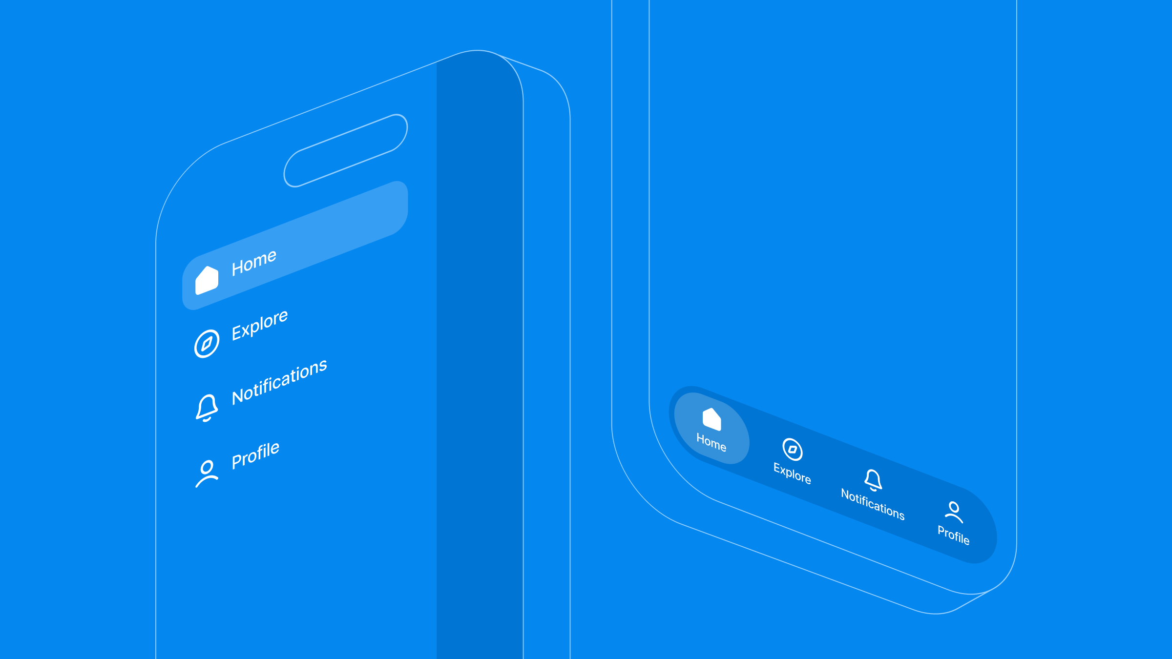
底部标签栏已经跑起来了。这时设计稿发过来,上面多了一个汉堡菜单,从标签栏上方滑出:工作区切换、设置、支持入口。现在你得同时用上这两套导航,一个嵌在另一个里面,还不能让抽屉的滑动手势跟图片轮播打架,也不能让每次打开菜单时标签状态被重置。
固定的底部标签栏配全局侧边抽屉,是跨平台应用里常见的组合。但要是把这两棵导航树随便嵌套,性能开销和手势冲突就会找上门来。
用 Expo Router,你可以把这些流程直接映射到文件系统目录上。代码保持模块化、可维护,底层干活的还是原生导航组件。我在 twitter 上分享过一个 demo,Expo 团队联系我说想让我讲讲过程。读完这篇,你应该能得到一个抽屉包着标签导航器的结构,外加主题和手势处理,让整体用起来不卡顿。
架构契合度:什么时候该嵌套抽屉和标签
把导航模式组合起来很强大,但不该成为默认做法。写代码之前,先想清楚你的应用 UX 是否真的能从双层导航结构中获益。大致分三种情况:
-
扁平导航(3 到 5 个高层级页面,路径彼此独立):用纯底部标签就够了。这里加侧边抽屉只会增加认知负担和视觉杂乱。
-
上下文隔离(多标签工作区,需要组织切换、支持这类无处不在的工具):把标签导航器嵌进外层抽屉容器里。
-
深度链接工作流(交易密集的仪表盘,用户会在深层子路由之间来回跳转):改用原生堆栈导航,配合上下文驱动的可见性。
架构取舍与限制
干净的文件系统布局路径能降低结构复杂度,但有几个约束值得了解:
-
状态同步: 把共享的全局状态或当前用户信息,从独立的抽屉路由(比如一个分离的
settings.tsx)往下传给嵌套的标签上下文,需要刻意做 context 作用域划分,或者引入外部 store。 -
平台手势冲突: 侧滑抽屉手势可能与标签页内部的横向元素冲突,比如可滑动的轮播图或滑动删除列表。限制
swipeEdgeWidth可以让这些交互保持可预期。
核心架构
要让导航状态保持统一,项目目录结构应当与布局树一一对应。Expo Router 不需要集中式的路由配置文件,而是用 (drawer)、(tabs) 这类文件夹分组语义直接声明视图层级。
app/
├── (drawer)/
│   ├── _layout.tsx         # Outermost navigation wrapper (configures side drawer)
│   ├── (tabs)/
│   │   ├── _layout.tsx     # Inner layout (configures persistent bottom tabs)
│   │   ├── index.tsx       # Home dashboard screen
│   │   ├── explore.tsx     # Explore feed screen
│   │   ├── notifications.tsx
│   │   └── profile.tsx     # User profile screen
│   └── settings.tsx        # Standalone global route accessed via drawer
└── _layout.tsx             # Root orchestration and app lifecycle entry point
1. 根级编排(app/_layout.tsx)
根文件是应用生命周期的起点。它负责管理原生启动屏,并挂载全局 context provider,确保任何子路由渲染之前运行时配置就已就位。
import 'react-native-gesture-handler';
import React, { useState } from 'react';
import { Slot } from 'expo-router';
import { GestureHandlerRootView } from 'react-native-gesture-handler';
import { SafeAreaProvider } from 'react-native-safe-area-context';
import { StyleSheet } from 'react-native';
import * as ExpoSplashScreen from 'expo-splash-screen';
import { ThemeProvider } from '../src/context/ThemeContext';
import SplashScreenView from '../src/screens/SplashScreen';

// Prevent splash screen from auto-hiding before initialization checks finish
ExpoSplashScreen.preventAutoHideAsync();

export default function RootLayout() {
  const [appIsReady, setAppIsReady] = useState(false);

  const handleSplashFinish = async () => {
    setAppIsReady(true);
    // Securely unblock rendering and hide native splash once app asset states are verified
    await ExpoSplashScreen.hideAsync();
  };

  return (
    <GestureHandlerRootView style={styles.root}>
      <SafeAreaProvider>
        <ThemeProvider>
          {/* Render layout contents once splash sequencing is complete */}
          {appIsReady && <Slot />}

          <SplashScreenView onFinish={handleSplashFinish} />
        </ThemeProvider>
      </SafeAreaProvider>
    </GestureHandlerRootView>
  );
}

const styles = StyleSheet.create({
  root: { flex: 1 },
});
2. 全局侧滑抽屉实现(app/(drawer)/_layout.tsx)
侧滑抽屉是最外层的布局边界,通过 expo-router/drawer 模块进行配置。把 drawerType 设为 'front',抽屉面板会覆盖在当前屏幕之上,而不是把屏幕推到一边。
import React from 'react';
import { Drawer } from 'expo-router/drawer';
import { useTheme } from '@/src/hooks/useTheme';
import DrawerContent from '@/src/components/DrawerContent';

export default function DrawerLayout() {
  const { theme } = useTheme();
  const c = theme.colors;

  return (
    <Drawer
      drawerContent={(props) => <DrawerContent {...props} />}
      screenOptions={{
        headerShown: false,
        drawerType: 'front',
        drawerStyle: {
          width: 270,
          backgroundColor: c.drawerBackground,
        },
        overlayColor: 'rgba(0,0,0,0.6)',
        swipeEdgeWidth: 40,
      }}
    >
      {/* Target internal tab group layout matching file path semantics */}
      <Drawer.Screen
        name="(tabs)"
        options={{ drawerLabel: 'Dashboard' }}
      />
      {/* Standalone layout entry outside of the core bottom tab bar */}
      <Drawer.Screen
        name="settings"
        options={{ drawerLabel: 'Settings' }}
      />
    </Drawer>
  );
}
3. 嵌套底部标签布局(app/(drawer)/(tabs)/_layout.tsx)
把标签布局文件夹嵌在 (drawer) 路径下,子路由就会自动继承抽屉的 context。微交互放在自定义组件里,布局文件因此可以专注于路由本身。
import React from 'react';
import { Tabs } from 'expo-router';
import { Platform } from 'react-native';
import { useTheme } from '@/src/hooks/useTheme';
import { DrawerSceneWrapper } from '@/src/components/DrawerSceneWrapper';
import AnimatedTabIcon from '@/src/components/AnimatedTabIcon';

const TABS = [
  { name: 'index', title: 'Home', icon: 'home-outline', activeIcon: 'home' },
  { name: 'explore', title: 'Explore', icon: 'compass-outline', activeIcon: 'compass' },
  { name: 'notifications', title: 'Notifications', icon: 'notifications-outline', activeIcon: 'notifications', badge: true },
  { name: 'profile', title: 'Profile', icon: 'person-outline', activeIcon: 'person' },
];

export default function TabsLayout() {
  const { theme, isDark } = useTheme();
  const c = theme.colors;

  const tabBarBg = isDark ? 'rgba(11,11,19,0.98)' : 'rgba(255,255,255,0.98)';
  const tabBarBorder = isDark ? 'rgba(255,255,255,0.06)' : 'rgba(0,0,0,0.05)';

  return (
    <DrawerSceneWrapper>
      <Tabs
        screenOptions={{
          headerShown: false,
          tabBarStyle: {
            backgroundColor: tabBarBg,
            borderTopWidth: 0.5,
            borderTopColor: tabBarBorder,
            height: Platform.OS === 'ios' ? 84 : 66,
            paddingBottom: Platform.OS === 'ios' ? 24 : 8,
            paddingTop: 10,
            elevation: 0,
            shadowColor: isDark ? '#000' : '#6060aa',
            shadowOffset: { width: 0, height: -2 },
            shadowOpacity: isDark ? 0.3 : 0.06,
            shadowRadius: 12,
          },
          tabBarActiveTintColor: c.tabBarActive,
          tabBarInactiveTintColor: c.tabBarInactive,
          tabBarLabelStyle: {
            fontSize: 10,
            fontWeight: '400',
            marginTop: 0,
            letterSpacing: 0.1,
          },
        }}
      >
        {TABS.map((tab) => (
          <Tabs.Screen
            key={tab.name}
            name={tab.name}
            options={{
              title: tab.title,
              tabBarIcon: ({ focused, color }) => (
                <AnimatedTabIcon
                  focused={focused}
                  icon={tab.icon}
                  activeIcon={tab.activeIcon}
                  badge={tab.badge}
                  color={color}
                  activeColor={c.tabBarActive}
                />
              ),
            }}
          />
        ))}
      </Tabs>
    </DrawerSceneWrapper>
  );
}
4. UI 层微交互(src/components/AnimatedTabIcon.tsx)
动画只在真正需要的地方运行。借助 React Native Reanimated 的 shared value,transform 和 opacity 变化都在 UI 线程上执行。每个微交互彼此隔离,标签动画不会引发父布局的连锁重渲染。
import React, { useEffect } from 'react';
import { StyleSheet, View } from 'react-native';
import { Ionicons } from '@expo/vector-icons';
import Animated, {
  useSharedValue,
  useAnimatedStyle,
  withTiming,
  withSequence,
  Easing,
} from 'react-native-reanimated';

interface TabIconProps {
  focused: boolean;
  icon: string;
  activeIcon: string;
  badge?: boolean;
  color: string;
  activeColor: string;
}

export default function AnimatedTabIcon({
  focused,
  icon,
  activeIcon,
  badge,
  color,
  activeColor,
}: TabIconProps) {
  const scale = useSharedValue(1);
  const dotOpacity = useSharedValue(focused ? 1 : 0);
  const dotScale = useSharedValue(focused ? 1 : 0);

  useEffect(() => {
    const ease = { duration: 200, easing: Easing.out(Easing.cubic) };
    if (focused) {
      scale.value = withSequence(
        withTiming(1.15, { duration: 100, easing: Easing.out(Easing.quad) }),
        withTiming(1, { duration: 150, easing: Easing.out(Easing.cubic) }),
      );
      dotOpacity.value = withTiming(1, ease);
      dotScale.value = withTiming(1, ease);
    } else {
      scale.value = withTiming(1, { duration: 160, easing: Easing.out(Easing.cubic) });
      dotOpacity.value = withTiming(0, { duration: 150, easing: Easing.out(Easing.quad) });
      dotScale.value = withTiming(0, { duration: 150, easing: Easing.out(Easing.quad) });
    }
  }, [focused]);

  const iconStyle = useAnimatedStyle(() => ({
    transform: [{ scale: scale.value }],
  }));

  const dotStyle = useAnimatedStyle(() => ({
    opacity: dotOpacity.value,
    transform: [{ scale: dotScale.value }],
  }));

  return (
    <View style={styles.iconWrap}>
      <Animated.View style={iconStyle}>
        <Ionicons
          name={(focused ? activeIcon : icon) as any}
          size={22}
          color={color}
        />
      </Animated.View>
      <Animated.View style={[styles.activeDot, dotStyle, { backgroundColor: activeColor }]} />
      {badge && !focused && <View style={[styles.badgeDot, { borderColor: 'transparent' }]} />}
    </View>
  );
}

const styles = StyleSheet.create({
  iconWrap: {
    width: 44,
    height: 28,
    alignItems: 'center',
    justifyContent: 'center',
    gap: 4,
  },
  activeDot: {
    width: 4,
    height: 4,
    borderRadius: 2,
  },
  badgeDot: {
    position: 'absolute',
    top: 0,
    right: 4,
    width: 6,
    height: 6,
    borderRadius: 3,
    backgroundColor: '#f43f5e',
    borderWidth: 1,
  },
});
5. 可扩展的主题架构:消除无样式内容闪烁
要在嵌套层级之间应用主题变更又不出现无样式内容闪烁,我们使用 design token。原始值映射到语义化的主题类型,组件、导航样式和布局因此都同步地从同一套 schema 取值。
// src/theme/colors.ts
export const palette = {
  indigo50: '#eef2ff',
  indigo100: '#e0e7ff',
  indigo400: '#818cf8',
  indigo500: '#6366f1',
  indigo600: '#4f46e5',
  indigo700: '#4338ca',
  neutral50: '#fafafa',
  neutral900: '#171717',
  white: '#ffffff',
  black: '#000000',
};

export type Theme = typeof lightTheme;

export const lightTheme = {
  dark: false,
  colors: {
    background: '#f8f8fc',
    surface: '#ffffff',
    primary: palette.indigo500,
    tabBarActive: palette.indigo500,
    tabBarInactive: '#b0b0c8',
    drawerBackground: '#ffffff',
    text: '#1a1a2e',
    statusBar: 'dark-content' as 'dark-content' | 'light-content',
  },
};

export const darkTheme: Theme = {
  dark: true,
  colors: {
    background: '#0f0f1a',
    surface: '#1a1a2e',
    primary: palette.indigo400,
    tabBarActive: palette.indigo400,
    tabBarInactive: '#4a4a6a',
    drawerBackground: '#13131f',
    text: '#eeeeff',
    statusBar: 'light-content' as 'dark-content' | 'light-content',
  },
};
小结与框架核心文档
这样嵌套导航,考验的主要是纪律性。用 Expo Router 把路由配置下沉到文件系统,布局就能干净地扩展,也不必维护一个庞大的配置文件。
关于配置和样式选项的更多内容,请查阅官方文档:
-
Expo Router 的目录分组:路由组如何嵌套,见 Expo Router 简介。
-
自定义抽屉:所有抽屉选项,见 Expo Router 抽屉指南。
-
React Navigation 标签栏选项:完整列表见 底部标签导航器文档。
接下来做什么
先从边界入手。让 (drawer)/_layout.tsx 渲染出来,然后把 (tabs) 组嵌套进去,确认两个布局都能正常显示,再去碰主题或动画。手势约束放到最后加,等结构稳定之后再说。按这个顺序搭建,你就不会同时调试滑动冲突和路由 bug。
如果你用这个模式做了点什么,或者碰到了我们没覆盖到的边界情况,欢迎来 Expo Discord 分享。我们常驻 Expo Router 频道,也会看大家的反馈。